
Annual Report Design Ireland: How to Create a Report People Actually Want to Read
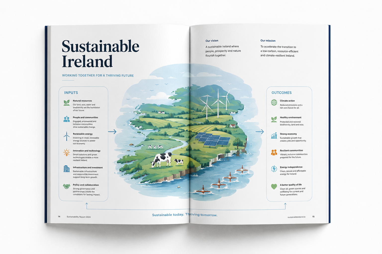
Every year, organisations across Ireland invest considerable time and resources in preparing their annual reports. Financial results are gathered, achievements are documented, statistics are checked and senior management carefully considers the messages it wants to communicate.
Yet once the report is published, an important question often goes unanswered.
Will anyone actually want to read it?
An annual report can contain excellent results, meaningful achievements and valuable information about an organisation's future. But if that information is buried in dense paragraphs, complicated tables and pages that are difficult to navigate, its value can easily be lost.
The challenge is not simply to produce a report that contains the right information. It is to create a publication that helps people understand that information, appreciate its significance and develop confidence in the organisation presenting it.
For Irish businesses, charities, universities, professional bodies and other organisations, annual report design offers an opportunity to do precisely that.
A well-designed report can make complex information easier to understand, demonstrate accountability, communicate progress and reinforce an organisation's reputation. It can help readers find the answers they need without having to work their way through every page.
At Pixelo Design, we believe the best annual reports begin with the reader. Good design should make information clearer, the reading experience more enjoyable and the organisation's achievements easier to appreciate.
So what separates an ordinary annual report from an excellent one?
And how can your organisation create a report that people will find genuinely useful?
1. An annual report is more than a record of the year
It is tempting to think of an annual report as a document that looks backwards. It records what happened during the previous financial year, summarises performance and presents the information required by shareholders, members, funders or other stakeholders.
Those responsibilities matter. But a well-considered annual report can achieve considerably more.
It can explain the decisions behind the results. It can demonstrate how an organisation has responded to challenges. It can show stakeholders where resources have been invested, what has changed and what the organisation intends to achieve next.
Most importantly, it can help readers understand why any of this matters.
Consider a company that has expanded its operations, invested in new equipment and increased its workforce. A report could present these developments as a series of financial figures and operational updates.
Alternatively, it could connect those figures to a wider narrative: how the investment supports growth, how expansion affects customers and employees, and what the company believes the next stage of development will look like.
The underlying facts remain the same. The difference is how effectively they are communicated.
This is where professional annual report design becomes valuable. It brings structure to the information, establishes a clear visual hierarchy and helps the reader understand the relationship between individual results and the organisation's broader objectives.
For Irish organisations competing for investment, maintaining public confidence or demonstrating the value of their work, that distinction matters.
Your annual report is an opportunity to show stakeholders not just what you did, but how you think, what you value and where you are going.
2. Start with the audience, not the page layout
One of the most common mistakes in annual report production is beginning with the document itself.
The team starts discussing page sizes, colours, fonts and cover concepts before agreeing on a more fundamental question:
Who is this report for?
An annual report may have several audiences, each with different priorities.
Shareholders may want to understand financial performance, risk and future prospects. Employees may be interested in organisational achievements, workplace developments and strategic direction. Customers may want reassurance about stability and service quality. Regulators and professional bodies may focus on governance, compliance and accountability.
For charities and not-for-profit organisations, the audience may include funders, donors, service users, volunteers, trustees and the communities the organisation serves.
These groups do not necessarily read a report in the same way.
A financial analyst might go straight to the financial statements. A prospective partner might look for evidence of organisational capability. A donor might be interested in how contributions have made a difference. A member of the public might want a straightforward explanation of what the organisation has achieved.
A successful report accommodates these different reading patterns.
That does not mean producing a separate document for every audience. It means designing a publication with a clear structure that allows readers to move quickly towards the information most relevant to them.
Before design begins, establish three things:
What does the reader need to know?
Identify the essential information the report must communicate.
What should the reader understand after reading it?
Think beyond individual facts. Consider the broader picture the information should create.
What should the reader be able to find quickly?
Identify the figures, statements, decisions and explanations that readers are most likely to seek out.
These questions influence everything from the contents page to the order of chapters, the presentation of statistics and the design of individual spreads.
At Pixelo Design, we approach annual reports as communication tools rather than collections of pages. Understanding the audience and the purpose of the report helps us make better design decisions from the outset.
3. Make the important information easy to find
Imagine opening an annual report and immediately encountering a page filled with tightly packed paragraphs, several tables and a collection of headings that all appear equally important.
You know the information you need is probably somewhere in the document. The problem is finding it.
This is a design problem.
Readers should not have to work unnecessarily hard to understand the structure of a report. They should be able to scan a page, recognise its main message and decide where to focus their attention.
A strong visual hierarchy makes this possible.
Visual hierarchy is the arrangement of information according to its relative importance. It helps readers distinguish a major achievement from a supporting detail, a chapter heading from a paragraph heading, and a headline statistic from the explanatory information around it.
Several design elements contribute to an effective hierarchy.
Clear headings
Headings should describe the information that follows, rather than simply filling space.
A heading such as "Performance" may be appropriate, but "Customer satisfaction increased for the third consecutive year" gives the reader a more immediate understanding of the section's message, provided the statement is supported by the data.
Consistent typography
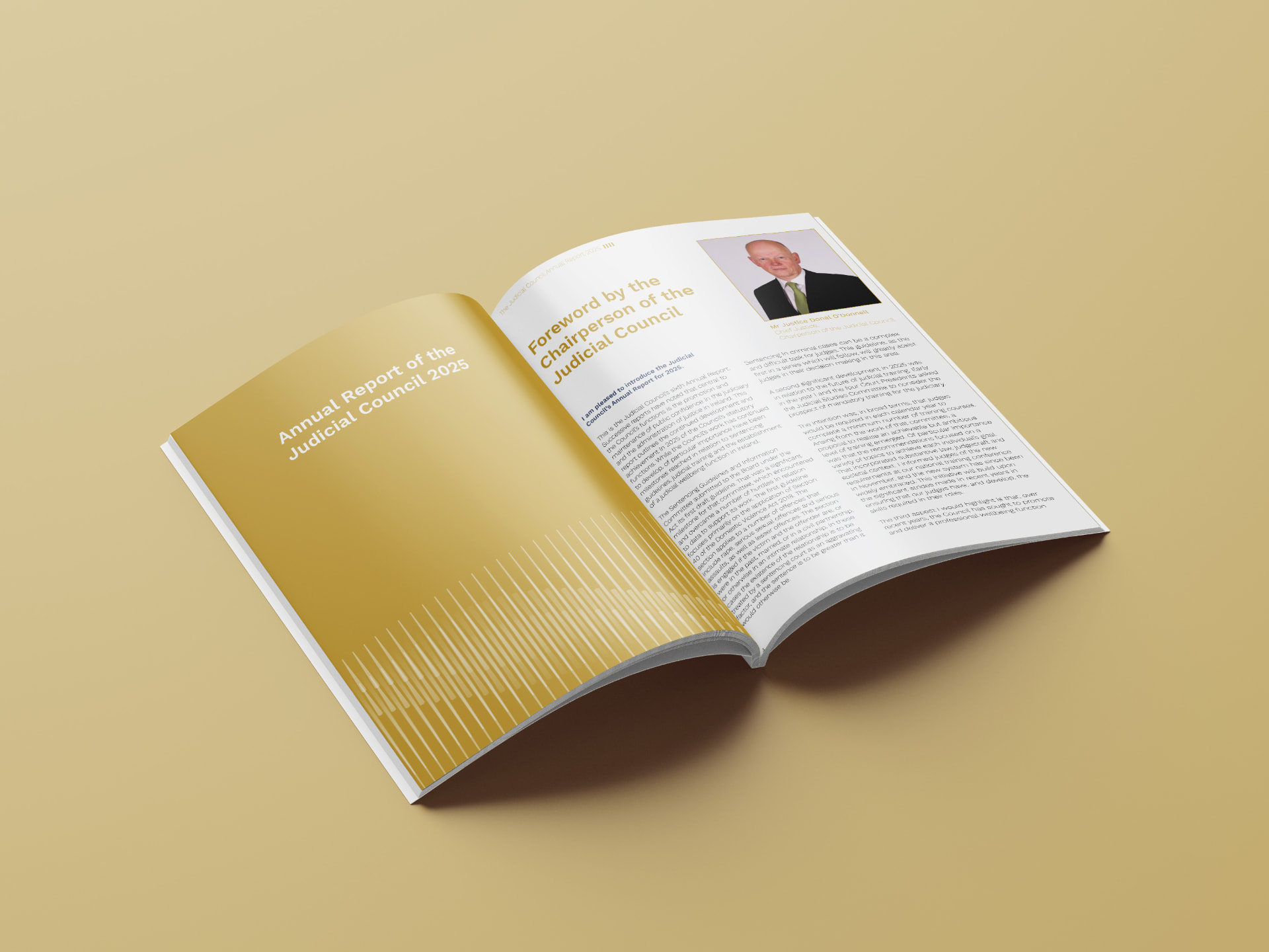
A report does not need dozens of typefaces to look sophisticated. A considered typographic system can create distinction between headings, body text, captions, quotations and financial information without introducing unnecessary visual complexity.
Appropriate spacing
White space gives information room to breathe. It separates ideas, makes pages less intimidating and helps readers recognise relationships between different elements.
White space is not wasted space. Used properly, it is part of the information architecture.
Meaningful emphasis
Bold text, colour, pull quotes and larger figures can help important information stand out. But if everything is emphasised, nothing is.
The most effective reports use emphasis selectively.
Consistent navigation
Readers should be able to understand where they are in the document and how to find related information. Consistent chapter openers, page numbering, running headers and contents references all help.
These elements may appear relatively small when considered individually. Together, they can transform the experience of reading a long publication.
Professional report design brings these elements into a coherent system, ensuring that every page feels connected to the whole.
4. Turn complex data into information people can understand
Annual reports frequently contain some of an organisation's most important information in numerical form.
Revenue, expenditure, employment figures, service statistics, operational performance, investment, emissions and other indicators can help stakeholders understand how an organisation is performing.
But numbers do not automatically communicate meaning.
A table containing twenty figures may be accurate, but it can be difficult to understand what those figures reveal. A chart may be visually attractive but offer little insight if its purpose is unclear.
Effective data visualisation bridges this gap.
It presents information in a form that helps readers identify patterns, compare results and understand relationships.
For example, a company reporting five years of revenue growth might present the figures in a table. That table may be appropriate for readers who need exact values.
A well-designed chart could complement it by showing the overall trajectory, making changes immediately visible.
Similarly, an organisation reporting on its services might use a combination of maps, charts and concise explanatory text to communicate its geographic reach, service volumes and outcomes.
The objective is not to replace detailed information with decoration. It is to make the information easier to interpret.
Choose the right visualisation
Different types of information call for different treatments.
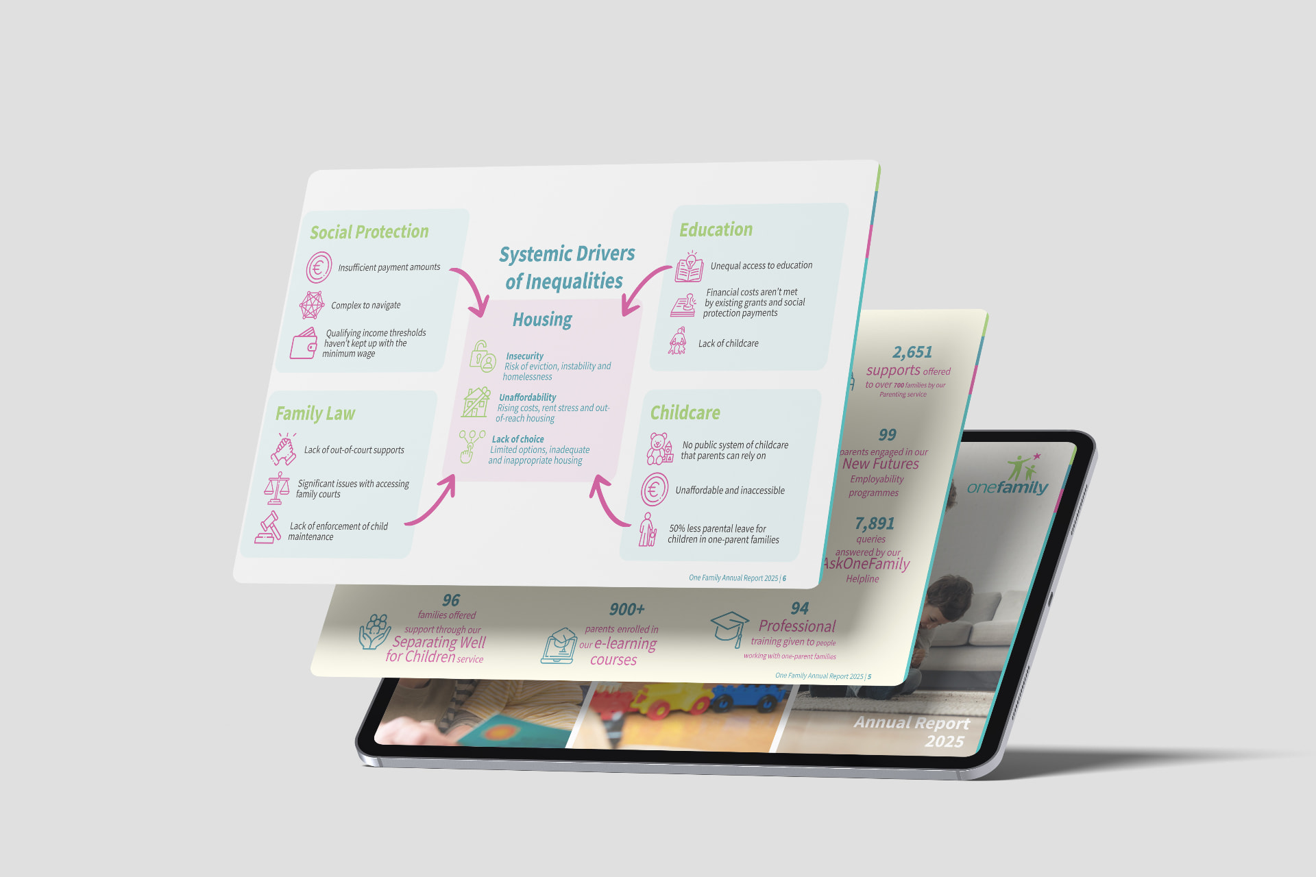
Bar charts are often useful for comparing categories. Line charts can communicate changes over time. Maps may help explain geographic distribution. Carefully designed infographics can make processes, relationships or complex sets of information easier to follow.
Sometimes a simple, well-formatted table is the best option.
The choice should depend on the question the reader needs to answer.
Make the message clear
A chart should not force readers to guess what they are looking at.
Clear labels, meaningful titles, appropriate units and explanatory notes help establish context. Where a comparison is important, the design should make that comparison easy to see.
Preserve accuracy
Design must never distort the underlying information.
Scale, colour, labelling and chart selection should be handled carefully. If figures are being compared, the comparison must be fair and understandable.
Use colour purposefully
Colour can distinguish categories, highlight important changes and create visual consistency. But it should not be the only way information is communicated.
Readers with colour-vision deficiencies may struggle with certain combinations, while poor contrast can make labels difficult to read.
The design should support understanding for as many readers as possible.
At Pixelo Design, information design and data visualisation are important parts of our approach to annual reports. We help organisations present detailed information in a way that respects its accuracy while making it more accessible to the intended audience.
5. Give your achievements a compelling narrative
Facts are essential to an annual report. But facts presented without context can leave readers struggling to understand their significance.
A report becomes more engaging when it connects performance, people, decisions and outcomes.
This is where narrative plays an important role.
A strong annual report does not need to read like a promotional brochure. It should remain credible, balanced and grounded in evidence. It should also help readers understand the story behind the figures.
Consider a charity that has supported thousands of people during the year.
A headline service figure establishes the scale of its work. A breakdown of services explains what the organisation delivered. Financial information demonstrates how resources were used.
A carefully chosen case study, presented with appropriate consent and respect for the people involved, can add another dimension by showing what that work meant in practice.
The figures and the human story serve different purposes. Together, they create a fuller understanding.
The same principle applies to commercial organisations.
A manufacturer might explain how investment in equipment improved production capacity. A university might connect research achievements with their wider implications. A professional body might show how its work supported members and strengthened standards within its sector.
The narrative should emerge from the evidence, not be imposed on it.
Find the central message
Before designing the report, identify the most important messages the organisation wants readers to take away.
These might include growth, resilience, service improvement, investment, innovation or progress towards long-term objectives.
Not every section needs to repeat the central message. But the report should have a clear overall direction.
Use evidence to support the story
Claims should be supported by figures, examples or other relevant evidence.
If an organisation describes a successful year, readers should be able to understand what made it successful.
If it reports progress towards a target, the report should explain the starting point, the result achieved and any important limitations.
Include the challenges
Credibility is not created by presenting every development as a success.
Where appropriate, an annual report should acknowledge difficulties, explain what the organisation has learned and describe how it intends to respond.
A balanced account can be more persuasive than an uninterrupted list of achievements.
Make the narrative easy to follow
Design helps connect the story across the document. Chapter openers, timelines, pull quotes, photography and carefully structured layouts can help readers understand how different parts of the report relate to one another.
The goal is to create a publication that informs without overwhelming and engages without exaggerating.
6. Use photography and illustration with purpose
Images can make an annual report more engaging, but their value depends on how they are selected and used.
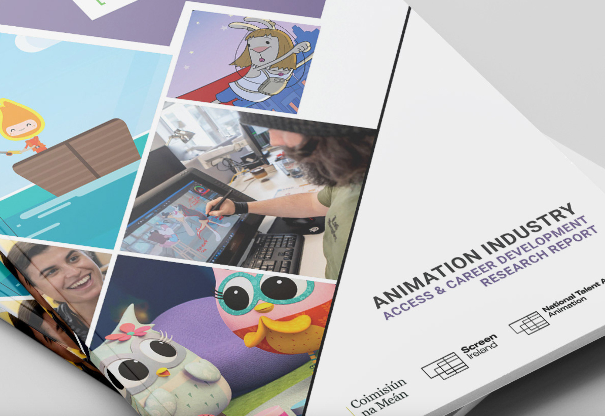
A photograph should contribute something to the communication. It might show the organisation's work in practice, introduce the people behind its achievements, establish a sense of place or help explain a complex subject.
An image chosen simply because it fills an empty space may add little.
For Irish organisations, authentic imagery can be particularly valuable when communicating local activity, regional development, community impact or the work of employees and service users.
Where appropriate, original photography can provide a more distinctive and credible account than generic stock imagery.
However, photography is not always the best choice.
Illustration may help explain a process. A diagram may communicate relationships more clearly than a photograph. An infographic may be the most effective way to present a set of statistics.
The important question is what will help the reader understand the information.
Consistency also matters.
A report that combines unrelated stock photographs, inconsistent illustration styles and competing graphic treatments can feel fragmented. A coherent visual approach helps the publication feel like a single, considered piece of communication.
Images must also be used responsibly. Organisations should ensure that they have appropriate permissions, that captions are accurate and that the use of identifiable individuals is suitable for the intended context.
Good design does not mean adding more imagery. It means using imagery where it adds value.
7. Accessibility should be considered from the beginning
An annual report may be published online and read by people with different visual, cognitive and physical abilities, using different devices and assistive technologies.
If the design makes the information difficult to access, some readers may struggle to use the report effectively.
Accessibility should therefore be part of the planning process, rather than an afterthought once the design is finished.
For Irish organisations, the precise accessibility obligations will depend on the organisation, the document and the applicable legal or contractual requirements. Public bodies and organisations with specific accessibility commitments should establish those requirements early and confirm what the final publication must deliver.
Even where a particular technical standard is not mandated, accessible design practices can improve the experience for a much wider audience.
Use readable typography
Text should be sufficiently large and clearly presented for comfortable reading.
Very small captions, tightly spaced paragraphs and long passages set in difficult-to-read typefaces can create unnecessary barriers.
Establish a logical structure
Headings should follow a meaningful hierarchy. Readers should be able to distinguish main sections from subsections and understand how the document is organised.
For digital documents, the underlying structure matters as well as the visual appearance.
A heading that merely looks like a heading is not necessarily identified as one by assistive technology.
Maintain sufficient contrast
Text needs to be distinguishable from its background. Colour combinations that look attractive on a designer's monitor may be difficult for some readers to interpret.
Contrast should be considered across body text, headings, captions, charts and other important elements.
Do not rely on colour alone
Charts and diagrams should use labels, patterns, shapes or other distinctions where necessary so that meaning is not conveyed exclusively through colour.
Consider the digital PDF
Accessibility in a PDF involves more than a visually clear layout.
Depending on the requirements, it may involve tagged document structure, correctly identified headings, logical reading order, meaningful link text, document language and alternative text for informative images.
A document can look excellent while remaining difficult to navigate using a screen reader.
That is why accessibility requirements should be discussed before the design process begins. The designer needs to understand the required output, and the final document needs to be checked against the relevant criteria.
Pixelo Design considers accessibility as part of its approach to report design. Where accessible PDF production is required, we can plan the document structure and production workflow accordingly.
The precise scope should be agreed at the beginning, including any required technical testing or validation.
The aim is straightforward: create a report that communicates effectively to the widest appropriate audience.
8. Make the report work on screen as well as on paper
Annual reports are increasingly encountered as digital documents.
A stakeholder may open the report on a laptop during a meeting, read selected sections on a tablet or use a phone to find a particular figure.
The report needs to work in these situations, not simply look good when printed.
This requires careful consideration of layout, file size, navigation and readability.
Design for the way people read digitally
Long paragraphs can be difficult to navigate on screen. Clear headings, shorter sections and meaningful visual breaks help readers locate information.
Important content should not depend on unnecessarily small text or details that become difficult to interpret at typical screen sizes.
Make navigation intuitive
A digital report should have a useful contents section and, where appropriate, clickable navigation.
Internal links can help readers move between related sections. External links should have clear labels so readers understand where they lead.
Keep the document practical
A large file can be frustrating to download or open, particularly on a slower connection.
Image resolution, compression and the final file size should be managed carefully without compromising essential image quality.
Consider interactive features selectively
Interactive contents, hyperlinks and other digital features may improve usability.
However, interactivity should serve a clear purpose. Adding features simply because they are available can complicate production without improving the reader's experience.
Check the finished PDF
The exported file should be checked at realistic viewing sizes, not just at high magnification in the design application.
Review navigation, page transitions, hyperlinks, image quality, text rendering and the overall reading experience.
If accessibility is part of the brief, include the relevant checks in the final quality-assurance process.
Pixelo Design can prepare annual reports for digital publication and commercial printing, with the format and production requirements agreed at the beginning of the project.
9. Build consistency without making every page look the same
Consistency is important in a corporate publication.
Typography, colour, heading styles, image treatments and page layouts should work together to establish a recognisable visual identity.
But consistency does not mean every page must look identical.
An annual report may contain financial statements, a chairman's statement, strategic information, employee stories, sustainability metrics and detailed operational data. Each section has different communication needs.
Applying the same layout to every type of content can make the report repetitive and less effective.
Instead, the designer should establish a flexible visual system.
This might include a consistent typographic hierarchy, a defined colour palette, standard chart styles, reusable tables, chapter-opening layouts and rules for the use of photography.
Within that system, individual pages can be adapted to suit their content.
A financial performance page might prioritise figures and comparisons. A section about organisational achievements might use photography and concise narrative. A governance section might need a more restrained layout that accommodates detailed information.
The visual language remains consistent while the presentation responds to the material.
This approach also has practical benefits.
Reusable design components can help maintain consistency across long documents and make revisions more manageable. If the organisation has established brand guidelines, the report can reinforce that identity while introducing layouts and visual treatments appropriate to the publication.
The result should feel distinctive without losing coherence.
10. What should an effective annual report contain?
There is no single structure that suits every organisation. The content and format should reflect the organisation's legal obligations, reporting purpose and audience.
Nevertheless, many annual reports benefit from a clear progression through several broad areas.
Opening overview
The opening pages should establish the reporting period, introduce the organisation and help readers understand the most important developments.
A concise overview of the year can be useful, particularly for readers who may not read the entire document.
Leadership commentary
A message from the chair, chief executive or another relevant leader can provide context for the year's results.
It should explain important developments, acknowledge significant challenges where appropriate and set out the organisation's direction.
Performance highlights
This section can summarise important achievements, milestones and changes during the year.
The strongest highlights are specific and supported by evidence rather than broad claims about success.
Strategic direction
Readers should understand the organisation's priorities and how the year's activities relate to its longer-term objectives.
Where relevant, the report can explain progress against targets and identify areas requiring further work.
Operational activity and impact
This is where the organisation explains what it actually did.
Depending on the organisation, the section may cover products, services, research, community programmes, projects, customer outcomes or other operational activities.
Financial performance
Financial information needs to be accurate, appropriately presented and consistent with the organisation's reporting requirements.
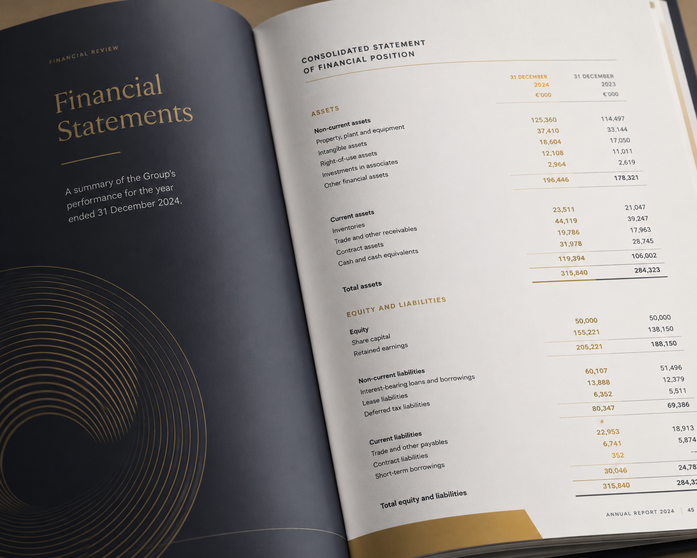
Visual summaries can help explain key movements, while detailed financial statements provide the supporting information required by the relevant audience.
Governance and accountability
The report may need to explain the organisation's governance arrangements, risk management, oversight and other accountability matters.
The exact content will depend on the organisation and applicable requirements.
Sustainability and ESG
Where relevant, the report may include environmental performance, workforce information, social impact, governance matters and progress towards sustainability commitments.
The content should reflect the organisation's actual reporting obligations and objectives rather than including sustainability material simply because it is fashionable.
Looking ahead
A useful conclusion explains the organisation's priorities for the next reporting period and provides context for its future direction.
This section should distinguish established plans from aspirations and avoid presenting uncertain outcomes as guaranteed.
The structure should be adapted to the organisation. A charity's annual report will not necessarily follow the same priorities as a listed company, university or professional body.
The guiding principle is to organise the material around what readers need to understand.
11. Annual reports in Ireland: compliance is the starting point
For Irish companies, it is important to distinguish an annual report as a designed publication from the statutory financial statements and annual-return requirements that apply under company law.
The Companies Registration Office explains that companies generally must provide financial statements with their annual returns, subject to applicable exemptions and requirements. Its guidance also outlines the relevant obligations concerning financial statements and directors' reports.
The precise requirements depend on the type and size of the company and its circumstances.
A professionally designed annual report does not replace the need for accurate financial statements, appropriate approvals or compliance with the relevant filing rules.
For organisations preparing a report, this means the design process should begin with a clear understanding of what must be included, which information has been approved and how the publication relates to the organisation's formal reporting obligations.
Designers should work from authoritative content and collaborate with the people responsible for financial, legal and governance review.
This is particularly important where a report contains detailed financial information, regulated disclosures or material that must be approved by the board.
What about sustainability reporting?
Sustainability reporting requirements have also been evolving.
In 2026, the European Union adopted changes that significantly narrowed the scope of the Corporate Sustainability Reporting Directive, including higher thresholds based on employee numbers and turnover. The implementation details and applicability to individual organisations must be checked against the relevant legislation and national implementation.
Consequently, organisations should not assume that every business in Ireland has the same sustainability reporting obligations.
Nor should they assume that sustainability reporting is relevant only when it is legally required.
Some organisations may continue to publish sustainability information because of investor expectations, customer requirements, business strategy, voluntary commitments or the information needs of other stakeholders.
For design purposes, the important consideration is the report's actual purpose and content.
If an organisation needs to communicate complex sustainability information, good information design can help readers understand its performance, targets and progress. However, the design must not obscure limitations, exaggerate achievements or imply compliance that has not been established.
The most effective reports combine accurate reporting with clear communication.
12. How to prepare your annual report for a smoother design process
A well-managed design project begins before the first page is laid out.
Annual reports frequently involve multiple contributors, detailed data, several rounds of review and a fixed publication date. Without a clear process, even a straightforward project can become unnecessarily stressful.
There are several steps your organisation can take to make production more efficient.
Appoint a project owner
Identify the person responsible for coordinating the report.
That person should understand the overall schedule, know who is responsible for each section and be able to coordinate feedback from the relevant contributors.
Establish the content plan
Agree the report's structure, the information required and the people responsible for supplying it.
A content plan helps identify missing material early and reduces the risk of important information arriving at the last minute.
Confirm the approval process
Determine who needs to review and approve the content and design.
Where several departments are involved, establish how feedback will be collected and consolidated.
Conflicting comments from multiple reviewers can cause unnecessary revisions if responsibilities are unclear.
Agree the timetable
Work backwards from the publication date.
Allow time for content preparation, initial design, stakeholder review, revisions, financial checks, accessibility work where required and final production.
The appropriate schedule depends on the length and complexity of the report.
Supply accurate source material
Provide approved text, tables, figures, captions and images wherever possible.
If content is still changing, make sure the designer knows which material is provisional.
Financial and other sensitive information should be checked by the appropriate people before final publication.
Agree the design brief
The brief should establish the audience, objectives, required formats, brand guidelines, approximate page count, accessibility requirements and deadline.
It should also clarify what is included in the design service and how additional work will be handled.
Plan for quality assurance
Final checks should cover both the content and the production.
Names, dates, figures, references, page numbers, headings and captions all need attention. The finished PDF should also be checked for visual consistency, file integrity and any agreed technical or accessibility requirements.
Pixelo Design uses a structured process to help keep report projects organised. Clear milestones, direct communication and agreed review stages help clients understand what is required and what happens next.
No design process can eliminate every risk, particularly when content or approvals arrive late. But good planning can significantly reduce avoidable pressure.
13. What does annual report design cost in Ireland?
There is no single price for annual report design because projects differ considerably in scope and complexity.
A short report using supplied content and established brand guidelines requires a different level of work from a long corporate publication containing complex financial tables, bespoke infographics, extensive data visualisation and detailed accessibility requirements.
Several factors influence the cost.
Page count: A longer report generally requires more layout and production work, although the amount of work per page varies.
Content readiness: Approved, well-organised content can make production more straightforward. Extensive restructuring, editing or content development may require additional work.
Design complexity: Bespoke layouts, illustration, photography, charts and infographics all affect the scope.
Data visualisation: The amount and complexity of data that needs to be presented visually can have a substantial effect on the work involved.
Accessibility: The required accessibility standard, document structure, testing and validation should be established at the outset.
Review process: The number of stakeholders, approval stages and expected revision rounds can influence the timetable and cost.
Production requirements: Print management, interactive features, multiple formats and other deliverables may add to the scope.
For Irish organisations obtaining quotations, it is worth comparing more than the headline price.
Ask what is included, how revisions are handled, who will manage the project and how the supplier will protect the publication deadline.
A low initial quotation may not represent the best overall value if important services are excluded or the production process creates unnecessary work for your team.
Equally, a larger agency is not automatically the right choice for every project.
A specialist studio may offer direct access to the designer, a focused workflow and a level of personal service that suits the organisation's needs.
The objective is to find a supplier whose experience, approach and pricing match the requirements of the report.
Pixelo Design quotes projects according to their scope and requirements, allowing clients to understand the proposed service and cost before work begins.
14. Choosing an annual report design agency
Selecting the right design partner is an important decision because the supplier will influence both the finished publication and the experience of producing it.
A strong portfolio is useful, but it should not be the only consideration.
Here are several questions worth asking.
Do they understand complex information?
An annual report is not simply a brochure with more pages.
It may contain financial statements, detailed tables, governance information, performance measures and complex narrative material.
The designer should be able to explain how they make this information clearer without compromising accuracy.
Can they demonstrate relevant experience?
Look for examples of reports similar to yours in length, complexity and purpose.
Experience with annual reports, sustainability publications, corporate communications or other information-heavy documents can be particularly relevant.
How do they manage deadlines?
Ask about project stages, review milestones, content dependencies and quality assurance.
A reliable supplier should be able to explain how the timetable will be managed and what they need from your team to keep the project moving.
Who will actually do the work?
Some organisations prefer a larger agency with a broader team. Others value a direct relationship with the person designing the report.
Neither model is automatically better. The important thing is to understand who will be responsible for the work and how communication will operate.
Can they support accessibility?
If accessibility matters to your organisation, ask how it will be addressed and what the supplier can deliver.
Make sure the scope reflects the required outcome rather than relying on a general claim that the report will be accessible.
Do they understand your audience?
A designer should want to understand who will read the report, what those readers need and how the publication can help them find and understand the information.
What else can they provide?
Some organisations benefit from working with a design partner who can also help with related publications, infographics, presentations, brochures or other communications.
This can make it easier to maintain consistency across different materials.
Ultimately, the right supplier is one that understands the brief, produces high-quality work, communicates clearly and can deliver the agreed scope within the required timetable.
15. Why specialist report design can make a difference
Annual report design sits at the intersection of editorial design, information design, corporate communications and production management.
It requires an understanding of how long documents work, how readers navigate information and how visual presentation can support comprehension.
A designer working on an annual report needs to consider the whole publication while paying attention to individual details.
A chart must be clear. A financial table must remain accurate. A chapter should fit into the wider structure. Typography must remain readable across different page types. The finished document must work as a complete publication rather than a collection of individually attractive pages.
This is why experience with complex publications can be valuable.
A specialist report designer understands that good design is not simply about making the cover look impressive. It is about making the entire report coherent, usable and appropriate to its purpose.
At Pixelo Design, this is the focus of our work.
We design annual reports, ESG and sustainability reports, corporate publications and other information-heavy documents for organisations that need to communicate clearly and professionally.
Our approach combines visual design with practical thinking about content, structure, readability and production.
We aim to create reports that reflect the organisation's identity while making its information easier to navigate and understand.
We also recognise that clients have demanding schedules and multiple responsibilities. A clear process, direct communication and agreed milestones help make the design stage more manageable.
For organisations that need support beyond their annual report, Pixelo also provides related design services, including brochures, infographics, information design and animated explainer videos.
That means a relationship can extend beyond a single publication where there is a suitable need.
16. The final test: would someone choose to read it?
Before signing off your next annual report, step back from the detail and consider the experience of the person who will receive it.
Can they quickly understand what the organisation does?
Can they find the information that matters to them?
Are the key achievements clear and supported by evidence?
Can they understand the important figures without having to decode complicated charts or tables?
Does the report communicate the organisation's character and professionalism?
Can readers with different needs access the information in the required format?
Does the document feel coherent from beginning to end?
These are practical questions, but they go to the heart of effective annual report design.
A report can satisfy its formal purpose and still be difficult to read. It can contain excellent information without communicating that information effectively.
Good design closes that gap.
It brings structure to complexity, helps readers recognise what matters and gives the organisation a clear, professional way to communicate its work.
For Irish organisations preparing their next annual report, the opportunity is to treat the publication as more than a yearly obligation.
It is a chance to demonstrate accountability, explain performance, communicate impact and strengthen relationships with the people who matter to the organisation.
The figures and facts provide the foundation. The structure, narrative and design help people understand what they mean.
And when those elements work together, the result is a report that does more than document the past year.
It helps readers understand the organisation and gives them a clearer view of what comes next.
Planning your next annual report?
Pixelo Design specialises in annual report design for Irish organisations, helping transform complex information into clear, engaging and professionally presented publications.
Whether you are preparing a corporate annual report, a sustainability publication or a report for a charity, professional body or public-sector organisation, we can help you develop a design that reflects your organisation and works for its readers.
Our services include report layout and design, data visualisation, infographics, accessible PDF production where required, and preparation of files for digital publication and print.
We work directly with clients to understand their requirements, agree the scope and establish a practical production schedule.
If your next annual report is approaching, the best time to discuss its design is before the content and deadlines become urgent.
Visit Pixelo Design to explore our annual report design services and discuss your next publication.
A good annual report should not simply be something your organisation has to publish.
It should be something your readers can understand, navigate and value.