Accuracy first
Axes start where they should, scales are consistent and nothing is exaggerated to look more impressive than it is.

Infographic & data visualisation
A statistic buried in a paragraph is a statistic nobody quotes. We turn research, performance data and processes into visuals that carry the point on their own — accurate, on-brand and accessible.
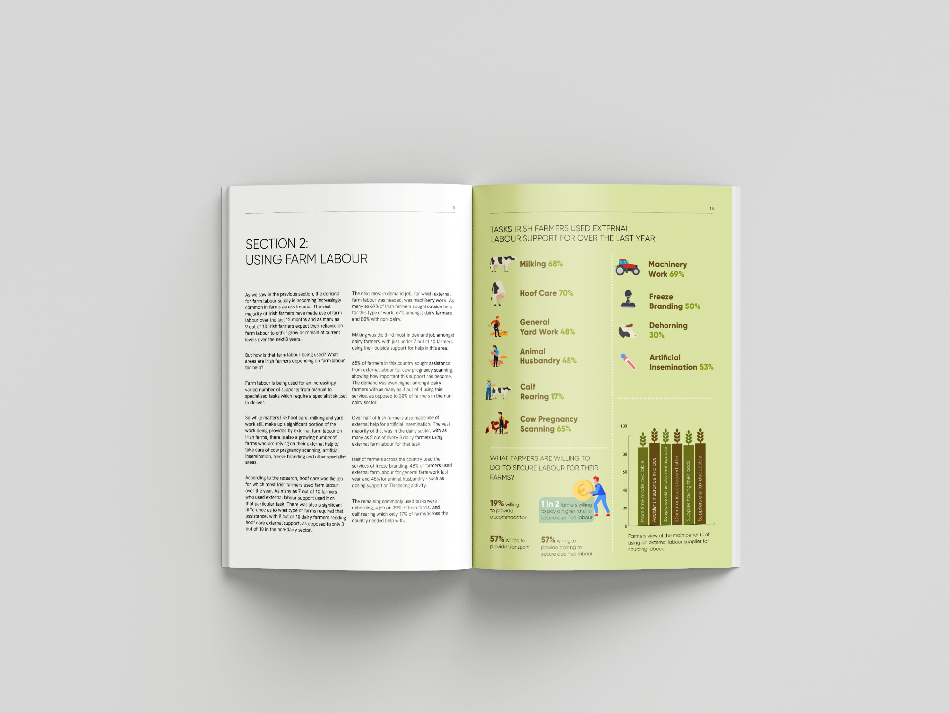
If it doesn't make a point, it's decoration taking up a page.
The most common problem with report graphics isn't that they look dated. It is that nobody decided what they were for. A donut chart with eleven segments, a bar chart of numbers that barely differ, a timeline nobody reads.
We begin with the sentence the visual has to prove. Once that's agreed, the right form is usually obvious — and often simpler than what the data arrived as.
Then we draw it properly: honest axes, a considered palette, annotation where the reader needs help and enough white space for the figure to land.
Across annual, ESG and research reports, the same handful of jobs come up repeatedly. We design each one as part of a consistent system rather than a one-off illustration.
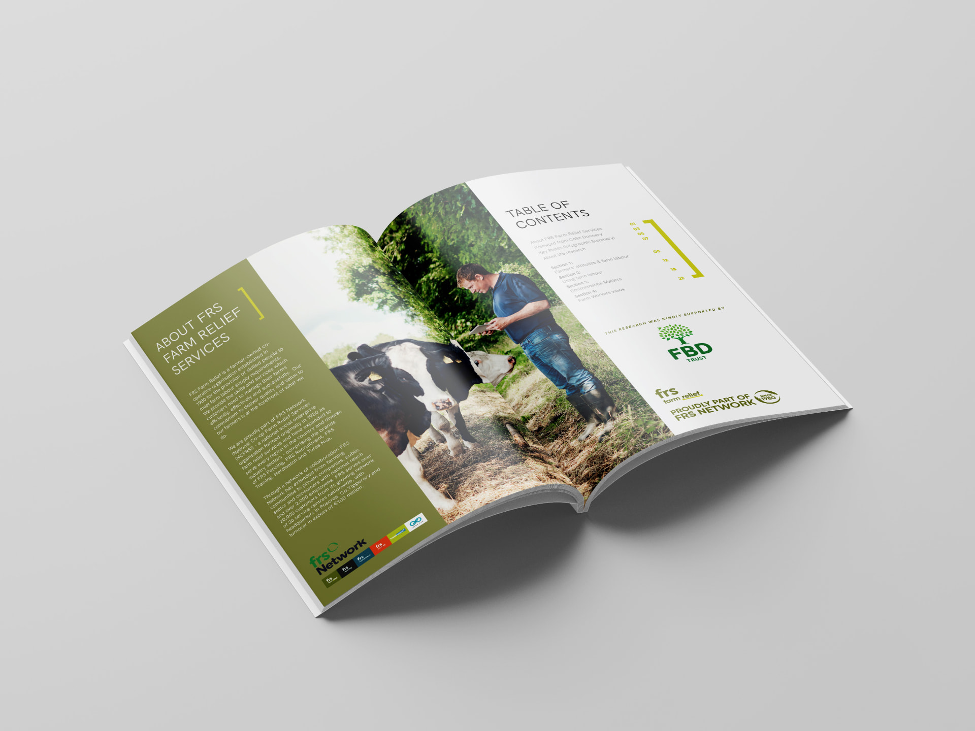
Axes start where they should, scales are consistent and nothing is exaggerated to look more impressive than it is.
A defined chart system means a reader learns how to read your data once and applies it for the rest of the report.
Shape, label and pattern support colour so figures remain readable for colour-blind and low-vision readers.
Data palettes derived from your identity, tuned for contrast and sequence rather than borrowed wholesale.
Editable templates handed over so next year's figures drop in without redrawing the visual.
Key visuals reformatted for slides, social and press so findings reach people who never open the PDF.
Research, performance and impact data designed to be understood immediately.
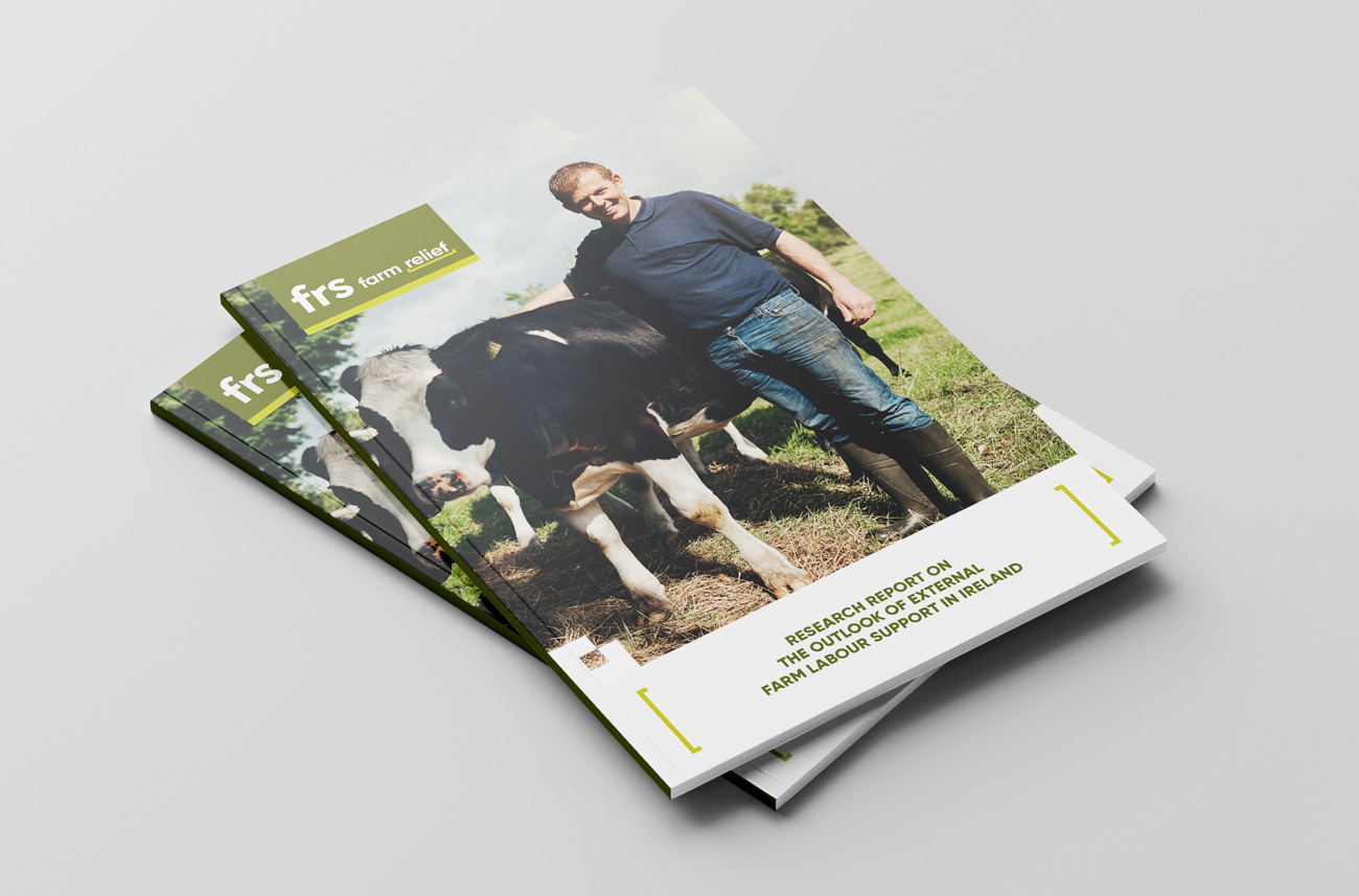
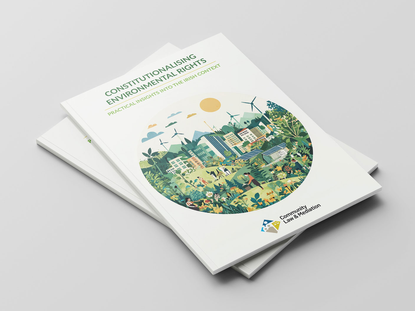
We review the data with you and agree the single point each visual must make before choosing any format.
Rough concepts for each visual, reviewed quickly and cheaply so direction is agreed before detailed work.
Final artwork produced within a consistent system, with contrast and accessibility checked as we go.
Print and screen versions, written alt text and editable templates for future reporting cycles.
“Complex performance data turned into clear visual storytelling. Our board described it as the most polished report we have ever published.”

Niamh Kelly
Reporting Manager, Maynooth University
Share your data and we'll suggest how it could be visualised, along with a fixed price for the set.